Designing a Lighted Storefront That Actually Sells
By Signscape Team • 2025-10-22 • 8 min read
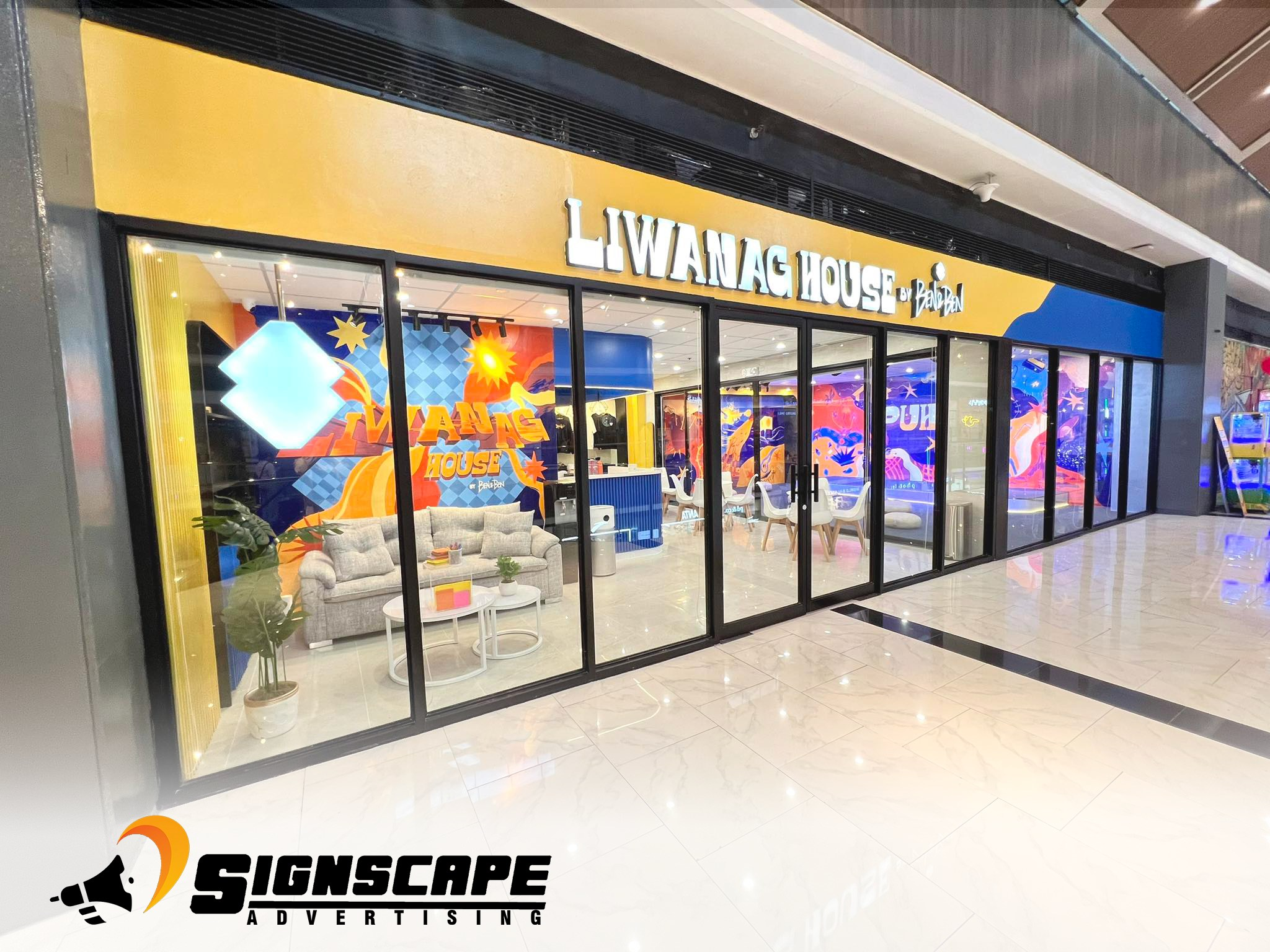
A storefront has one job: turn passing attention into a decision to step inside. Lighting is the difference between a logo that merely exists and a storefront that communicates. When we evaluate a facade for a lighted sign we start with the behavior we want to trigger. Are we asking someone to notice a brand at fifty meters, recognize it at twenty, and decide to enter within ten? Those distances guide size, contrast, and illumination long before we debate finishes.
### Why visibility beats decoration
Most disappointing signs are beautifully made but poorly seen. Visibility comes from proportion—letter height, stroke weight and spacing—combined with contrast against the background. The common “one inch per ten feet of viewing distance” rule is useful, but we tune it for typefaces and approach speeds. A heavy sans-serif reads larger than a condensed script at the same letter height. If traffic approaches from an angle, we bias the layout to the approach direction so the most important word is visible first.
### Designing with light
Light is not a finish; it’s a medium. We try to achieve three things: uniform face illumination, controlled halo for depth, and deliberate hotspots where accents matter. For face-lit letters we specify LED modules at densities that achieve 350–700 lux on the acrylic, depending on finish and color. White or warm white shows brand colors accurately, while RGB is better reserved for accent or seasonal programming. For halo-lit letters we care about standoff distance—typically 20–40 mm—to avoid a muddy glow.
Drivers are sized to 70–80% of their rated load to extend life, and we group letters on drivers based on maintenance zones. A driver tucked behind one letter that can only be reached by removing the entire word is a service headache waiting to happen. We plan cable runs and access hatches during design, not on the ladder.
### Material choices that survive
Acrylic thickness is determined by span and depth. 3 mm faces on small letters may look fine in the shop but will oil-can outdoors. On larger letters we use 4.5–6 mm acrylic with aluminum returns and ACP backers to keep weight reasonable while resisting heat. For painted finishes we use 2K polyurethane systems with UV resistance, and we seal joints with neutral cure silicone so plastics don’t yellow.
Mounting is engineering, not guesswork. A concrete wall may take sleeve anchors easily, but a thin masonry facade needs a distributed frame to avoid point loads that crack tiles. On malls with aluminum cladding we use backing plates and concealed frames that can be removed without damaging the cladding.
### Layout: tell a story at walking speed
A visitor glances three times: from corridor to storefront, from overall brand to entrance, and then to the first product or service cue. We organize signage to support that sequence. Primary brand above the entrance, secondary callouts nearer eye level, and wayfinding inside. Too often, brands place every message at the same hierarchy and nothing stands out. The best storefronts have one bold voice and a handful of whispers.
### Operations and maintenance
A great sign should be easy to keep great. We label power supplies, note driver-to-letter maps, and provide a quick-clean kit with approved cloths and solutions. Acrylic hates ammonia; a five-dollar bottle of glass cleaner can create permanent haze. We design for access: removable faces, serviceable modules and protected wiring. A six-month checkup—wipe, check fasteners, verify drivers—can add years to useful life.
### Case example: Café at a corner unit
The client wanted warmth without looking like a bar. We used warm white face-lit channel letters on a charcoal ACP band, with a subtle halo around the first letter to create focal depth. Letter heights were staged: the brand name at 600 mm for visibility across the atrium, the tagline at 150 mm not to compete. Drivers sat in a service hatch above the ceiling line right behind the sign, with a labeled isolation switch. The result: a store that glowed as if it were always golden hour, measurable increases in walk-ins, and easy maintenance for the mall team.
### What to ask your fabricator
Ask for shop drawings that show section cuts, materials, LED layout, and driver locations. Ask how many watts the whole sign will draw, and where the isolation switch will be. Ask for a cleaning guide. If a vendor can’t answer those, you’re buying decoration, not a storefront system.
When a storefront is engineered like a system—proportion first, light that works, materials that last—you don’t just get a bright sign. You get a store people feel comfortable walking toward.